Client: Steven Speck
Role: Logo Design, Branding, Graphic Design
Brief: Create a logo and brand identity that appeals to 18-30 year olds while exuding prominence and reliability. Design branded materials for social media, eLearning courses, and print documents.
Logo Design
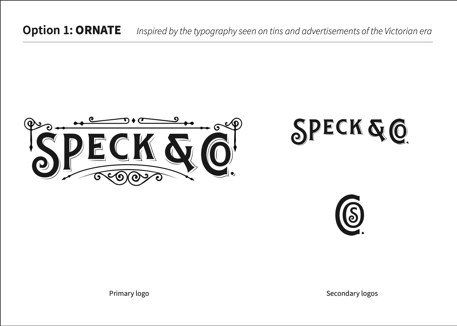
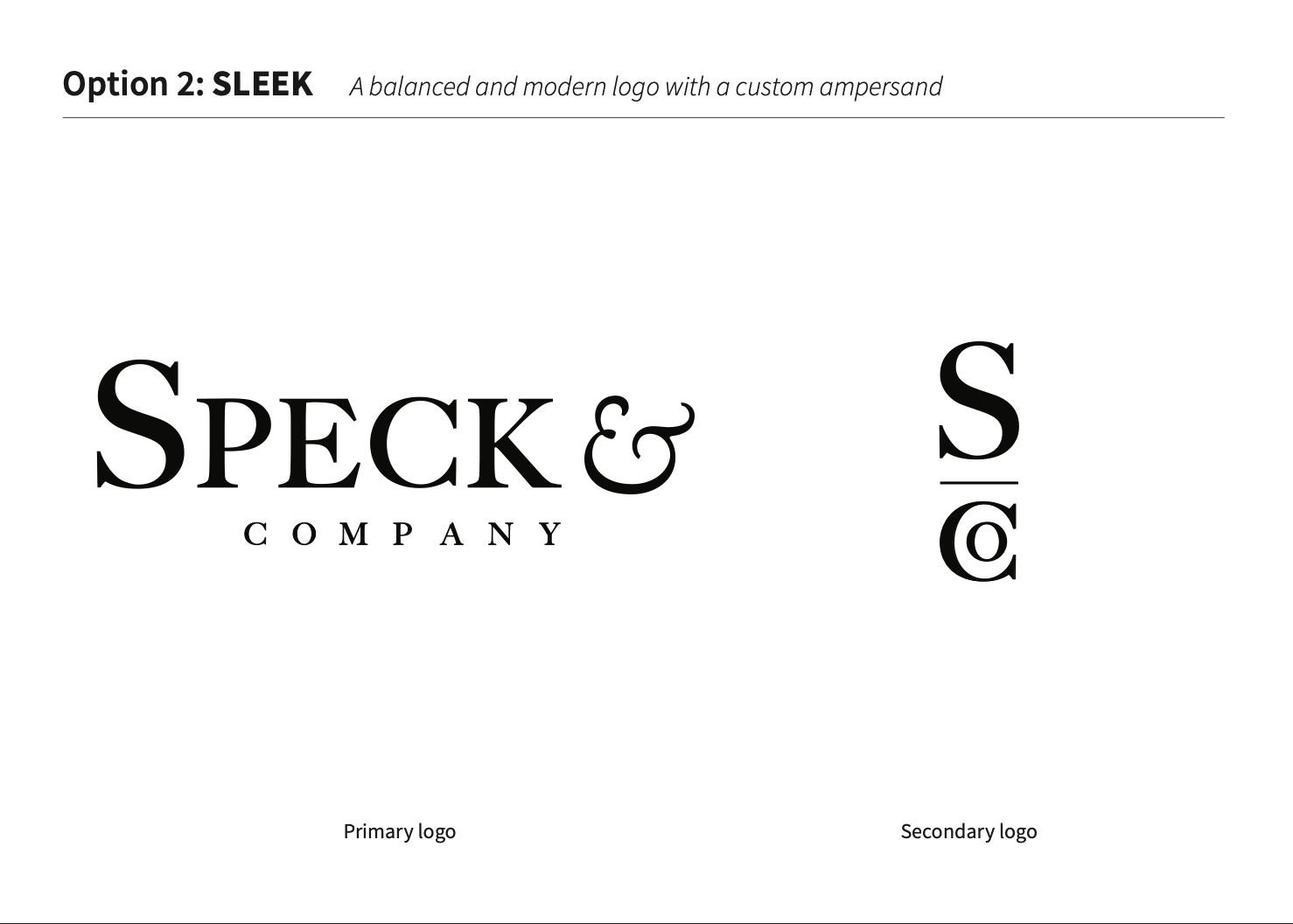
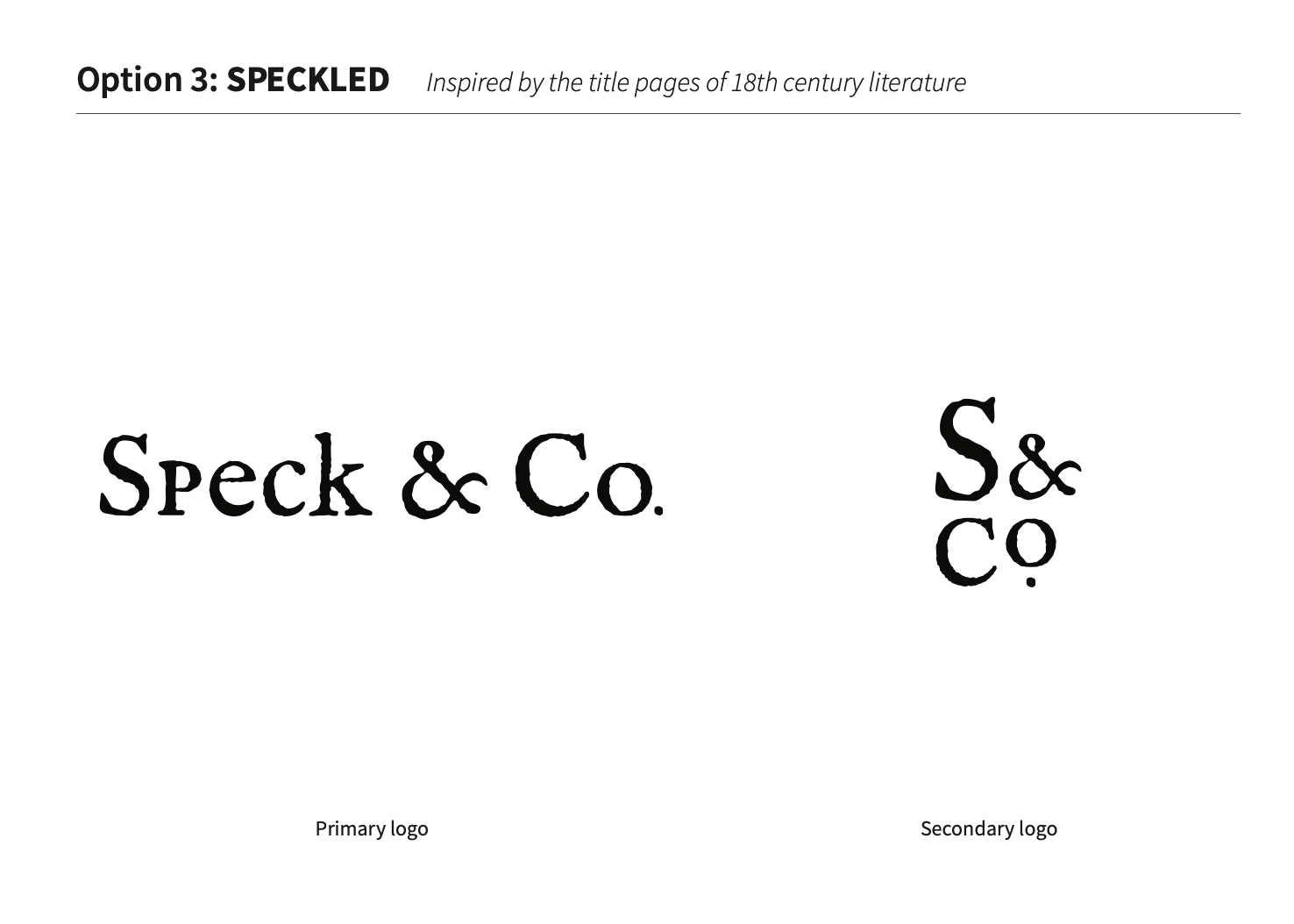
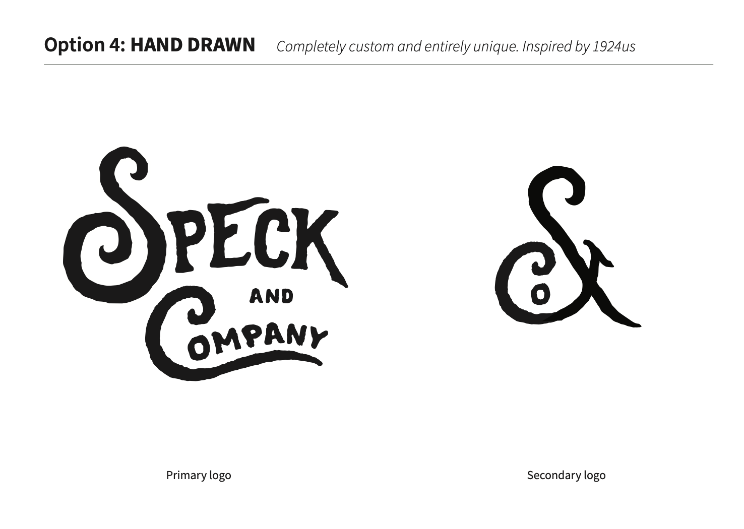
I developed four different logos inspired by the client’s reference images from 1924US, and historic typography.
Branding
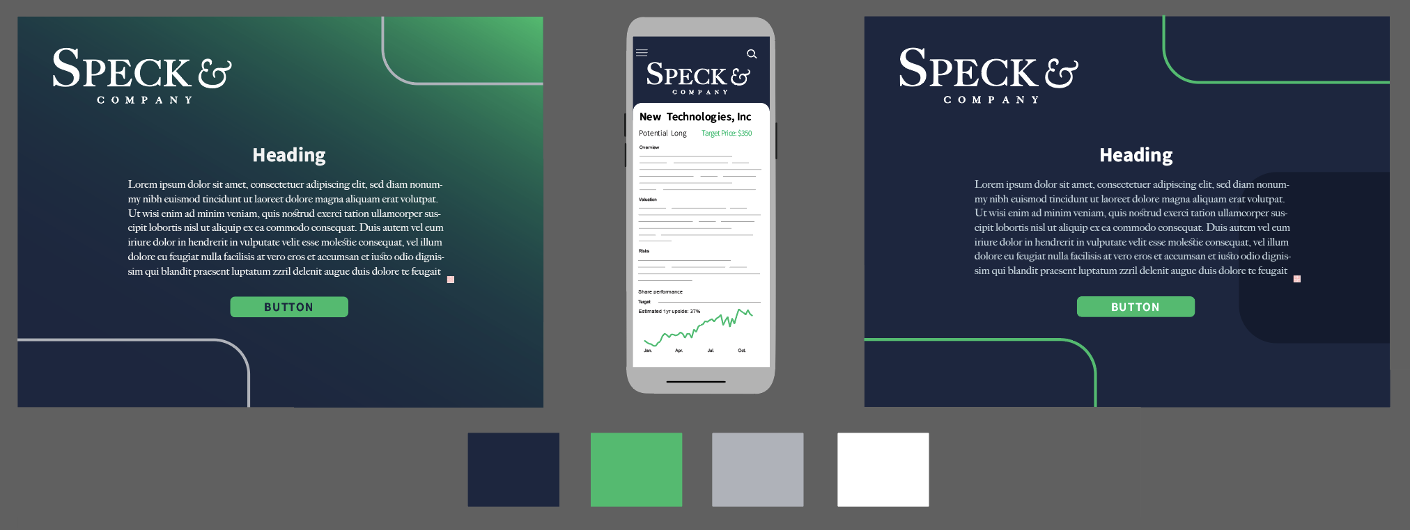
The client chose Option 2: SLEEK, so I developed a brand identity to accompany it. I featured Source Sans as the paragraph typeface for its flexibility, youth-like quality, and web-safeness. Based on market research, I chose the main navy color to signify strength and reputation. The mint green color was chosen as the accent color to signify money and growth.
Document Design for Print and Online Course
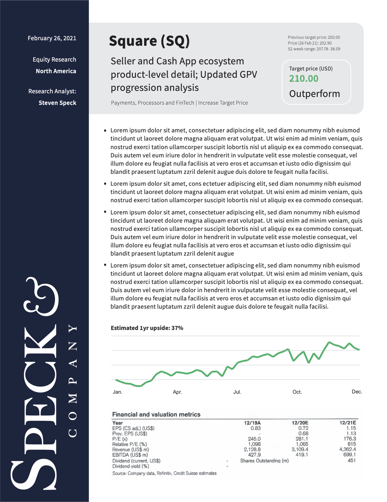
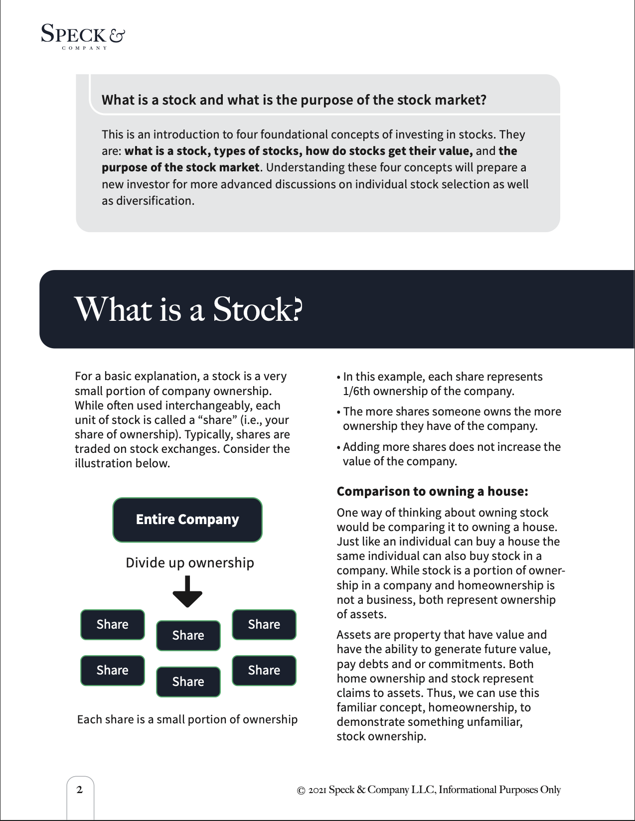
Speck & Co. offers free and paid financial resources for young adults interested in investing. I used the design principles of proximity and hierarchy to effectively communicate the information.
Social Media
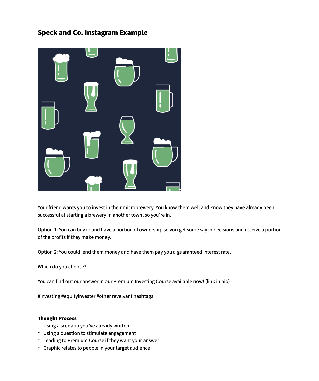
Since the target audience is 18-30 year olds we chose to focus our social efforts on Facebook and Instagram. Below is an example post.
